Singapore International Foundation
uiux revamp
Singapore International Foundation (SIF) underwent a website rebrand and redesign to better reflect its evolving identity while improving the way users discover its programmes, initiatives, and global impact. The project focused on creating a modern, accessible, and user-centred experience by restructuring content, simplifying navigation, and aligning the platform with WCAG accessibility guidelines to ensure a more inclusive digital experience.
My role:
• Led the end-to-end UX/UI design for the website rebrand, from stakeholder workshops and information architecture to high-fidelity designs and developer handoff.
• Translated the refreshed brand identity into a cohesive, accessible digital experience with improved navigation, content hierarchy, and WCAG-compliant design considerations.
• Created reusable UI components in Figma and collaborated closely with developers to deliver a responsive, production-ready website.
My role:
• Led the end-to-end UX/UI design for the website rebrand, from stakeholder workshops and information architecture to high-fidelity designs and developer handoff.
• Translated the refreshed brand identity into a cohesive, accessible digital experience with improved navigation, content hierarchy, and WCAG-compliant design considerations.
• Created reusable UI components in Figma and collaborated closely with developers to deliver a responsive, production-ready website.
the problem
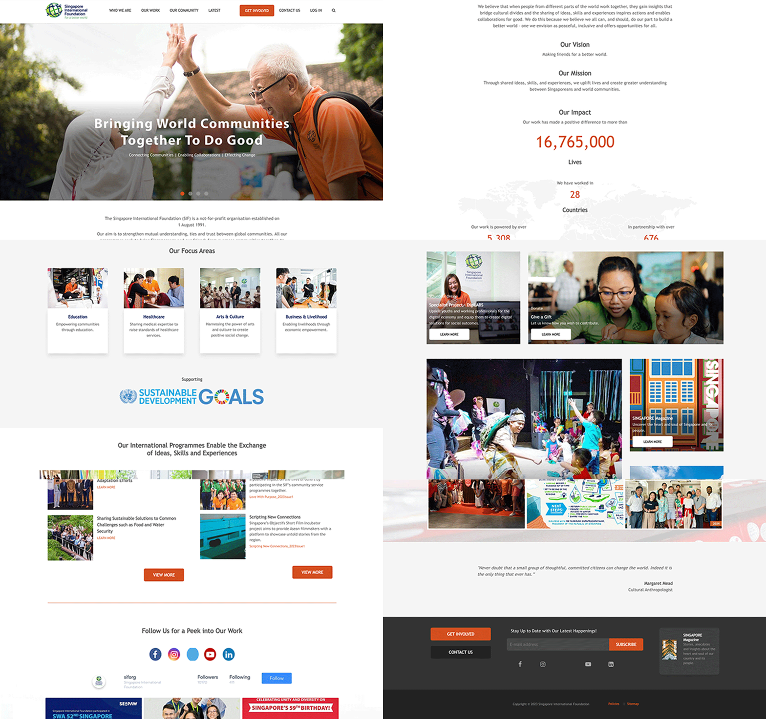
The previous look (shown in GIF below) lacked a clear content structure, making it difficult for users to locate key information. The absence of a strong content hierarchy and navigation flow created friction in the browsing experience, particularly for users trying to understand SIF’s programmes and initiatives.
Several visual design choices also impacted usability. Gradient overlays were used to enhance text readability, but instead reduced overall clarity and visual consistency. Additionally, social media content occupied a significant portion of the layout despite not being dynamically updated, resulting in inefficient use of space.
Several visual design choices also impacted usability. Gradient overlays were used to enhance text readability, but instead reduced overall clarity and visual consistency. Additionally, social media content occupied a significant portion of the layout despite not being dynamically updated, resulting in inefficient use of space.
Previous design
the approach
To address these issues, we began by reviewing the existing content and identifying key user needs across different audience groups. Wireframes were used to reassess the information architecture and determine the number of templates required to support the content more effectively. This allowed us to establish a clearer structure and prioritise important information before moving into the visual design stage.
Accessibility was also a key consideration throughout the process, ensuring the redesigned website aligns with Web Content Accessibility Guidelines (WCAG) AAA standards and provides an inclusive experience for all users.
Accessibility was also a key consideration throughout the process, ensuring the redesigned website aligns with Web Content Accessibility Guidelines (WCAG) AAA standards and provides an inclusive experience for all users.

Wireframes
Improved layout

solution – final design
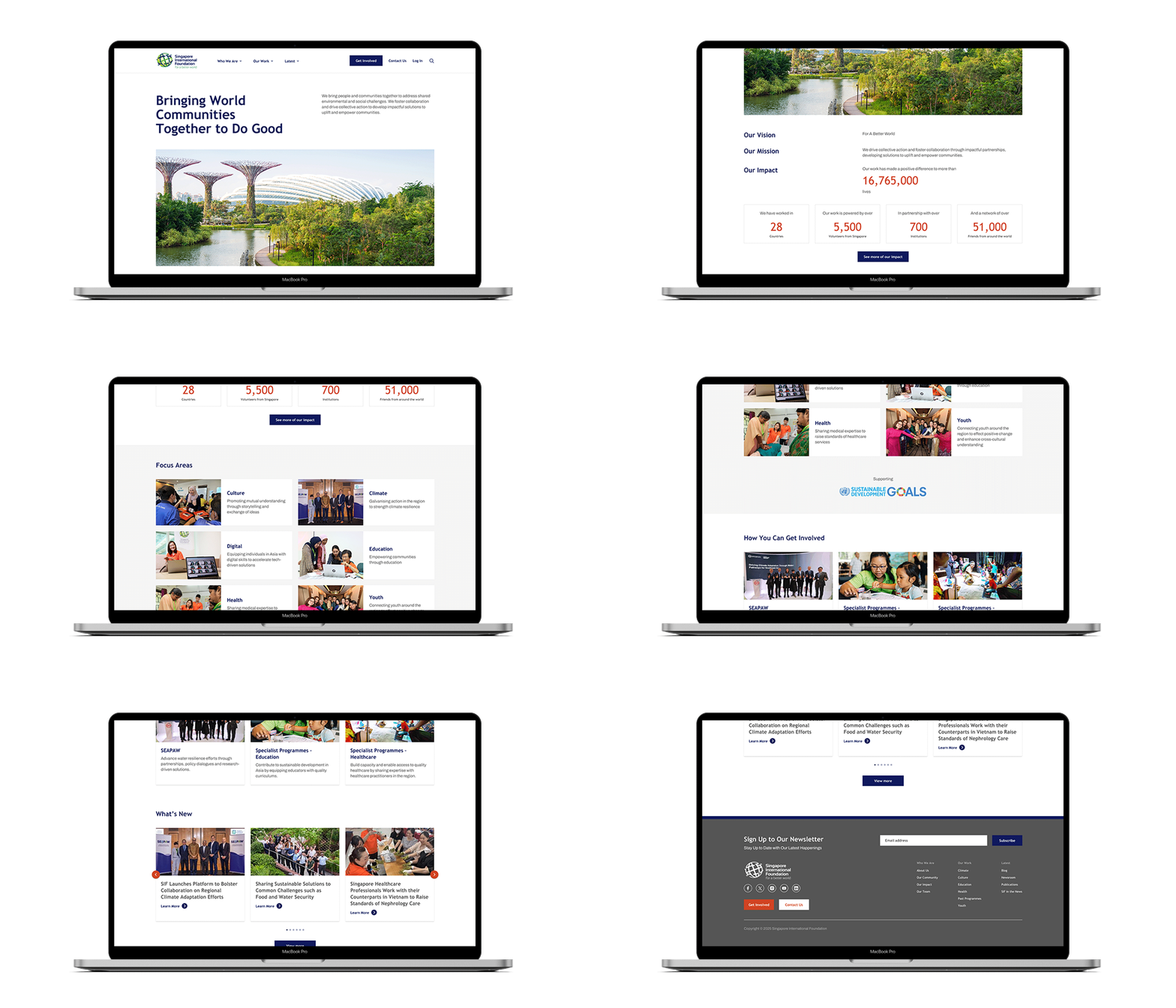
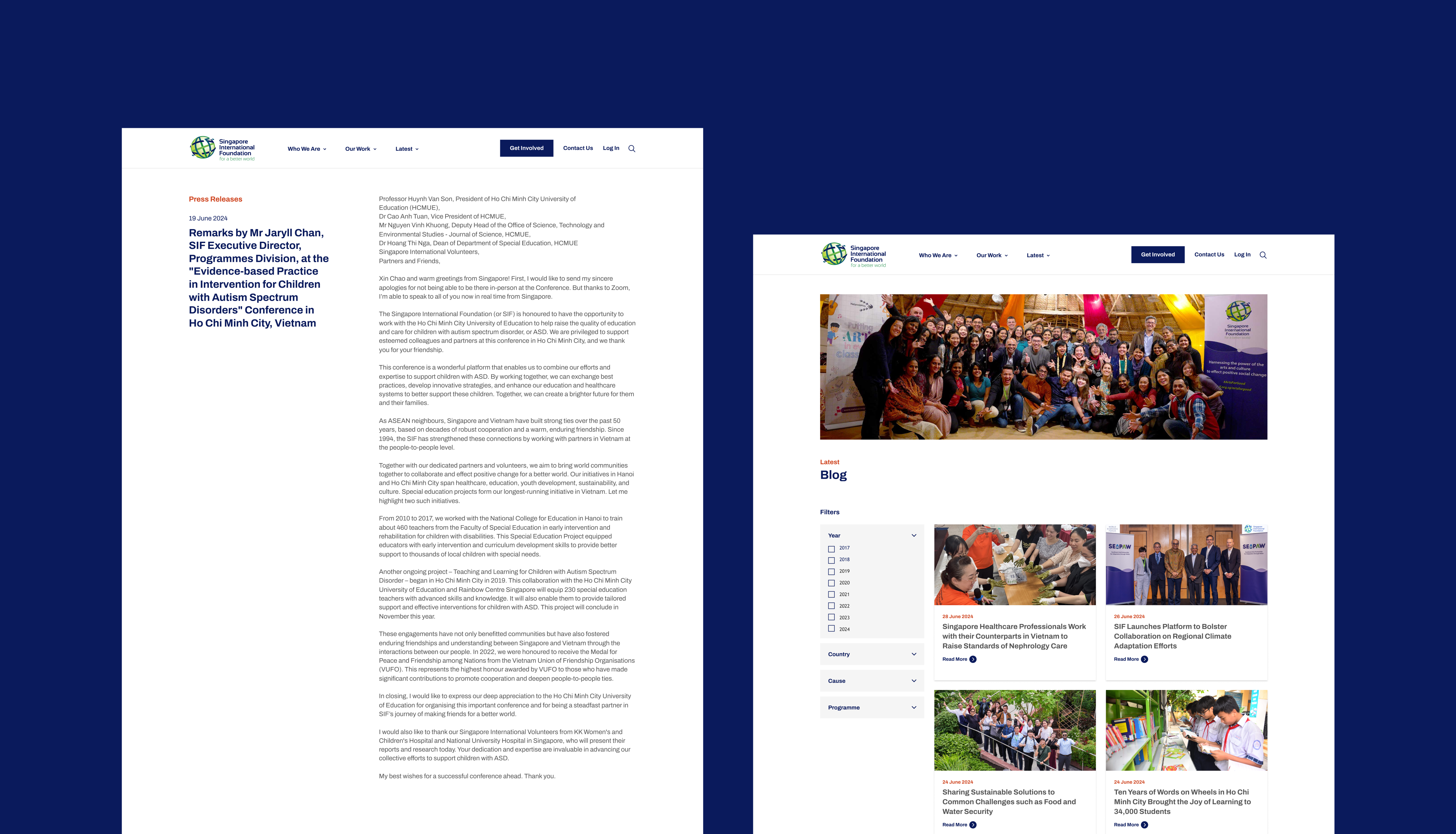
The redesigned website introduces a clearer content hierarchy, improved navigation, and a more structured layout to help users find information more easily. Visual treatments were simplified to enhance readability and overall consistency across the site.
The organisation’s corporate colours were also brought forward more prominently, strengthening brand presence while maintaining clarity and accessibility. Overall, the redesign delivers a more intuitive and accessible experience across devices, supporting the mission of the Singapore International Foundation to connect Singaporeans with global communities.
The organisation’s corporate colours were also brought forward more prominently, strengthening brand presence while maintaining clarity and accessibility. Overall, the redesign delivers a more intuitive and accessible experience across devices, supporting the mission of the Singapore International Foundation to connect Singaporeans with global communities.